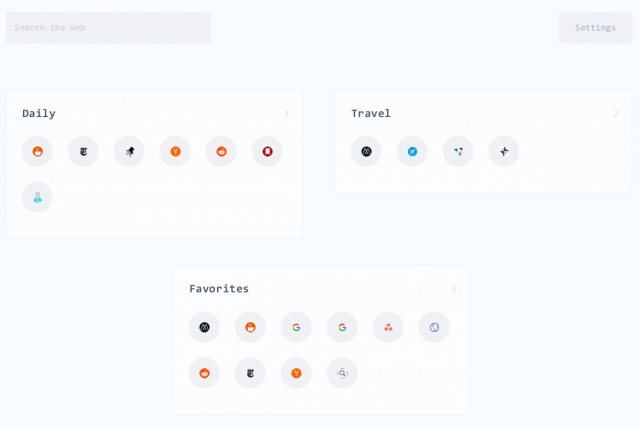
For a while now I've been struggling with managing browser tabs. Most of the time I seem to be working on tens of tasks at once, each task in its own window with many tabs. As everything has become web-centric, the collection of open windows and tabs has become unmanageable. For a while I tried tab groups, but found that this became just as cluttered as having multiple open windows. I still had tons of tabs open, except now they were hidden in layers in a single window rather than spread over my desktop.
I've also tried to tackle this with bookmarks in the past, both in-browser and cloud based services. These too quickly become an unwieldy mess, to my mind the hierarchical tree approach is not well suited as a mental map. I use Pocket and Evernote extensively, but these are better suited to long-term archival and note taking than bookmarking. What I really wanted was something similar to the Android and iOS app screens but for web pages, with the ability to open entire sets of pages with a single click. A quick way to get back where I left off in a browsing session.
When I searched around for an off-the-shelf solution I found suprisingly few that looked like good candidates. The closest was Start.Me , a firefox start page packaged as an extension. However this does not support opening entire sets of links. I decided that I would have to roll my own solution.
Reddit has a group dedicated to start pages and I started looking there for ideas. Eventually I stumbled across LaunchBot which seemed to satisfy all of my requirements:

The author has kindly shared the code on github, so I forked it to my own Git repo to modify some functionality to better fit my needs and modify the styling. I stripped out the icon retrieval code and simply provided my own locally hosted icons, amending the config file format to support this. At the head of the page I added some search bars (Google, Wikipedia, YouTube the Cambridge Dictionary and Google Translate). The weather widget wasn't working for me, so I replaced it with another and a clock. Lastly the stylesheet has been heavily remodelled to meet my requirement for an app screen type layout.
In the end I decided the widgets were a superflous and got rid of them. The finished portal page, which has cleaned up my desktop no end!
